What's going on Wix Nation, MPS here from Wix Training Academy and today I'll be showing you how to utilize the impressive new breakpoint technology within Editor X and how to add breakpoints, edit them, customize them, and even delete them.
Before we jump into this video. Number one, if you're just joining us here on the channel, thank you so much. And if you want to make sure that you never miss any content, especially surrounding Editor X in our brand new Editor X Training Series. Make sure to click that subscribe button and turn those bell notifications on. Plus, you'll join the largest Wix Training Community on the internet and who doesn't want to be a part of that? Especially when learning a brand new editor by Wix.
Let's go ahead and jump into today's video.
The Breakpoint Technology

Okay guys. So we're here in Editor X and as mentioned today, we are going to be highlighting the Breakpoint technology that Wix has added as part of the Editor X functionality. Now let's start by establishing what the break point technology is.
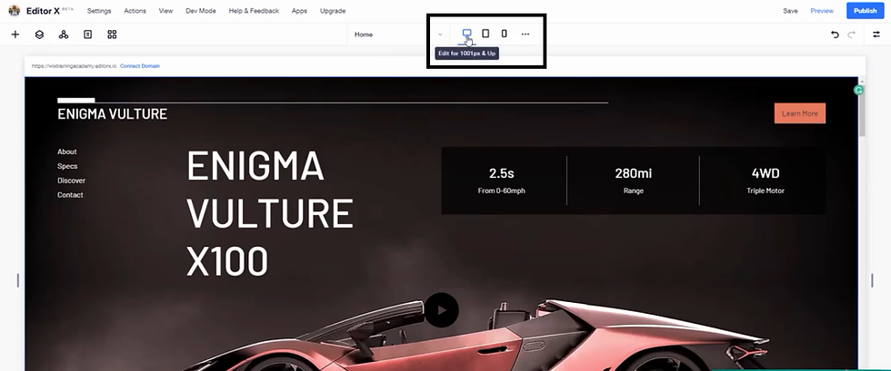
First and foremost, as you know in the classic editor, you can switch between the desktop and the mobile view website and edit and design them as you needed for each of those views. Well, Editor X is responsive. That is the biggest component of why Wix built this new editor and now they've got three default views, you can edit between. But more importantly, elements will actually move responsively to each of these outlooks. They can be seen over here.
Three Default Views

You've got desktop, what would be equivalent to 1,001 pixels and up. You've got tablet view, which would be equivalent to 751 to a thousand pixels and you've got mobile view, which would be from 320 to 750 pixels. If we switch between them, we will see our canvas changes but more importantly the element that the actual visitors will see change to be responsive. They're not all clumped together anymore. They're not rearranged, not all messed up. It’s responsive. If we move to mobile, you'll see the same thing.
The elements move in a responsive manner and are not, are no longer scattered all over the place and you're hiding elements, viewing elements, adding elements, shrinking elements. That's not a problem anymore. That's what this editor fixes. Now with that said, these are the three default views. However, you may be asking yourself, well, what if a tablet isn't that particular size or what if I have another viewing device or maybe I've got a massive desktop screen that I want the website to look clear and crisp spot . Here's how to adjust to that. What you would do is you'd come over here to these three dots and you can customize break points, which means you've got your default break points here.
Customizing Breakpoints

The thousand and up cannot be adjusted at the moment. You can only add additional break points above that, because that and up is infinite, meaning, it'll stretch to whatever width but maybe you do have a custom screen size that is larger than that, in which case you can add a breakpoint larger and then you'd be able to edit that 1001 pixels to whatever that next breakpoint is.
To give you some clarity on this, let's just say we're adding another break point. We've got another screen size and let's just say it's not 320 to seven 50 but maybe it's 320 to 500. So let's just punch in here, 325 pixels and you can see right now it says 320 pixels to 325 pixels but that's not what we want. We want this to go to 500 pixels. So we want it 320 pixels to 500 pixels, so now our break point’s changed. We've got a screen size that's 320 pixels to 500 pixels and then our other break point is switched. It's now 500 and one pixels, above where your cap is off of your previous break point to 750 pixels.
What's really cool about this is you can add as many break points as you want and then it'll actually add up here in the menu to show what that different screen size would theoretically look like. So that way you can flip in between them and edit accordingly.
So if you noticed that when you shrink down to this additional break point that we just added and it looks correct, well perfect, but maybe something looks off on it and the responsiveness doesn't look as much as you'd like. Well you still have the ability to move text. The great thing is, is whatever you change in this breakpoint doesn't change in your other breakpoints. So you have the ability to edit for each view, whether that's tablet, laptop, desktop, mobile a customed screen, whatever that may be. You can add those breakpoints in here.
For example, if we go back and we add another breakpoint, maybe we've got one that's 1,200 pixels rather than a thousand pixels. If we add that, you'll notice it's not no longer 1,001 pixels and up. It's 1,001 pixels to 1,200 and then our new break point is 1,201 pixels and up. You can go up to 10,000 pixels. So anywhere from, I believe it's 300 to 10,000 pixels is the range you have to customize break points for your website responsively through Editor X.
Deleting Breakpoints

Now if we want to delete a breakpoint, let's just say we want to delete that 321 we can come in here and we can press delete.
However, you will notice, if you delete the 320 to 500 pixels breakpoint for this page, you will lose all of it’s design and layout properties. So just to be clear, whenever you delete a breakpoint, you are deleting that entire breakpoint. That entire view that’s customized there. The other ones will not change and will not be affected, but this particular view will and you would press delete.
Changing or Editing Breakpoints

But maybe you don't want to delete a breakpoint completely. You'd like to change it or edit it. What you can do is, you can hover over it. We've got this 320 to 750 and you can click the little pencil button. Click edit and then you can change this. Maybe you want that 350 to 600 and then you would press done. And now you've got an additional break point and another viewpoint that you can edit from and you change the look and feel of that breakpoint.
This is how the new break point technology works in Editor X.
Conclusion
It's really nifty. It's really cool and I really like how each view is added up here as an icon to help you get a feel for exactly what it's going to look like on that style breakpoint, to feel the view of what your visitor is going to feel.
If you have any questions regarding break point technology, please let me know but just understand that this feature is probably the biggest and heaviest reason that Wix made Editor X. So it's pretty large to be able to understand and manage breakpoints here in Editor X.
If you enjoyed this video, drop a like down below, comment and let me know your thoughts on this, if you have any questions. And lastly, you're not going to want to miss any of this Editor X training content. Make sure to click that subscribe button and turn those bell notifications on, so you’ll never miss any. Plus, you'll join the largest Wix Training Community on the internet. Seems like a pretty great place to be when learning a brand new editor.
I'm excited to continue pushing forward in our Editor X training series. As mentioned, right now we're on module one, covering the workspace within Editor X. We'll start to dive deeper and deeper into it as we continue to expand and get past the workspace portion of Editor X.
Thank you guys for watching. I'll catch you in our next one.
EPS Machine EPS Cutting…
EPS Machine Eps Raw…
EPS Machine EPS Recycling…
EPS Machine EPS Mould;
EPS Machine EPS Block…
EPP Machine EPP Shape…
EPTU Machine ETPU Moulding…
EPS Machine Aging Silo…
EPTU Machine ETPU Moulding…
EPS Machine EPS and…
EPS Machine EPS and…
AEON MINING AEON MINING
AEON MINING AEON MINING
KSD Miner KSD Miner
KSD Miner KSD Miner
BCH Miner BCH Miner
BCH Miner BCH Miner